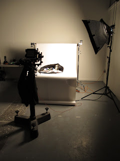
Starting off early in the morning with everything I needed I met up with Ian Turner as we both arrived at the main entrance. We quickly identified studio three as being empty so we proceeded to set up, and within an hour and a half or so had everything arranged.
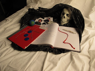
Having arranged the set as per my test shots I spent a long time discussing the layout with Steve, and we spent a fair amount of time discussing the cover of the training record book, should it be visible, or folded back? Despite my initial fears the red cover would be overpowering, Steve convinced me that the red cover was better off displayed. That was the first change to my last draft/test shots images. Having explained the reasoning behind all the objects and the order etc, Steve then advised I strip back the number of objects to create a cleaner image. Steve is obviously being a fan of a minimalist approach I took on board his comments and we spent the next few hours adjusting the items. My initial idea reflected the busy/chaotic nature of redundancy, but this obviously made the message less easy to read and possibly to personal to my individual situation with regards to some of the specific objects.
With regards colour Steve also liked the use of repeating shapes and colours so we worked on that aspect also taking pictures along the way as we built up and then altered the objects.
Having completed that I then asked Jonathan for his opinion and that prompted an interesting discussion about my proposed background. The test shots were created on a sheet (simply because I have no backdrop at home yet), and Jonathan really liked the idea of using a sheet. It created images in the mind of lay ins, hours wasted in bed, all the things people associate with not working. Where as Steve had liked the clean white "It's like the blank pages of the book", which is a part of the narrative of the image. With contrasting views we stopped for lunch at which time I procured a sheet.
Rather than replicate a bed, and taking into account this is a symbolic image I opted to place the sheet over the background, re-building the set/objects on top, creating texture and more interest in the background. As much as Jonathan would have liked a bed against a wall looking banal and showing the emptiness, my idea slightly differed. It wasn't an empty banal experience, it was scary, exciting, worrying, at times unpleasant, a shock but not banal, so I accepted the idea of the sheet but positioned it over the existing background as already mentioned. The sheet becomes symbolic of rest and home after activity and work which I think works as a concept.
Prior to the shoot I purchased film and was shown how to load the dark slides (another new skill!), myself loading the first two, Ian doing the second two. With four frames being used.
After turning the light up to full power (because we had a large soft box) we identified the range of F stops available to us which was actually between F 5,6 and F22. Steve once again advised what he thought would give me the depth of field I required to maintain sharpness on the objects,with focus trailing off in the foreground and background. We shot at F11 1/400th (using a 210mm lens) and used a 160 ISO colour film for the first test shot. The exposure looked to be reasonable (to my untrained eye!), although I'd not clicked the dark slide fully home on the camera, thus not exposing about 5mm of the neg. We re-shot the test and this time there were no technical issues. Further discussions led us to moving the tripod back slightly, prior to shooting two more final images. All negs were obviously processed and discussed prior to further shots being made.
I think with hindsight I could have moved back further to give more leeway/ breathing space for printing. That could have been the fifth image from the pack which would have worked out nicely (if we split the film between Ian and myself). But time was against us, and I was looking for a tight image, I really didn't want the bag to be small in the frame, I wanted the viewer to be lead into the bag visually. If I had pulled back further though this simple move would have given me more freedom and choice at the printing stage. I was also given some late advice from Jonathan (after we'd shot the images) about shooting black, about not being afraid to over expose it (giving detail in the blacks, the highlights can always be toned down in the printing stage. Good advice I thought.
The following images were taken during the day to record the process for the blog (canon G11)
 |
| Inital Object layout |
 |
| Objects removed, awaiting 'extra layers' |
 |
| Close up with a number of items returned |
 |
| Final layout and objects |
 |
| Overview with the addition of the new background for the final images |


No comments:
Post a Comment